pit.fit
Website Redesign
The Perfect Fit
My first assignment of my senior year Digital Design class was to get in contact with a local company and ask them if they were interested in a website redesign. My partner got in contact with her kickboxing gym, pit.fit, since she noticed their website was pretty outdated and they were fine with it. In its current state the site did it’s job in providing information to local residents about their unique classes and schedules. We learned quickly that our job was to modernize the site and get rid of all the inefficiencies. This project was the perfect introduction to my senior year and to this day is one of my favorite projects.
September 2018
Design Tools
Adobe XD - Wireframing & Prototyping
Brackets - Coding
Slack - Team Communication
Team
Reginald Lata - UX Designer
Kelly Wong - UX Designer
The Design Process
This was my first time working with a client outside of Cal Poly and it was a bit nerve-wracking approaching companies for work, but thankfully the pit.fit crew were super chill about everything. We first did extensive review of their current website and mapped out the features we wanted to keep and what we wanted to remove. Although we were a team, my partner and I designed and coded two different websites, but we collaborated throughout the process.
What Doesn’t Fit?
When we met with our client, Antonio Banuelos, he explained to us that he wanted the website to feel more family-friendly and more reflective of their gym. When we visited their website, we didn’t find many huge problems, but we did feel like it could be cleaned up and create an easier layout for their users navigate.
Prelim Prototype
Before diving into coding I needed to layout the website in a prototype. This prototype helped me figure out what looked good and what was possible to code. I tried to stay as simple as possible and allow navigation to be easy to understand.
Revelation: After reviewing prototypes with my partner, I realized that I was staying too safe. What we were looking for in the final product was to create a site that eliminated the need to click to multiple pages to find information that could be found on one page. So for my final code I challenged myself to create a one-page scroll website.

The Right Fit
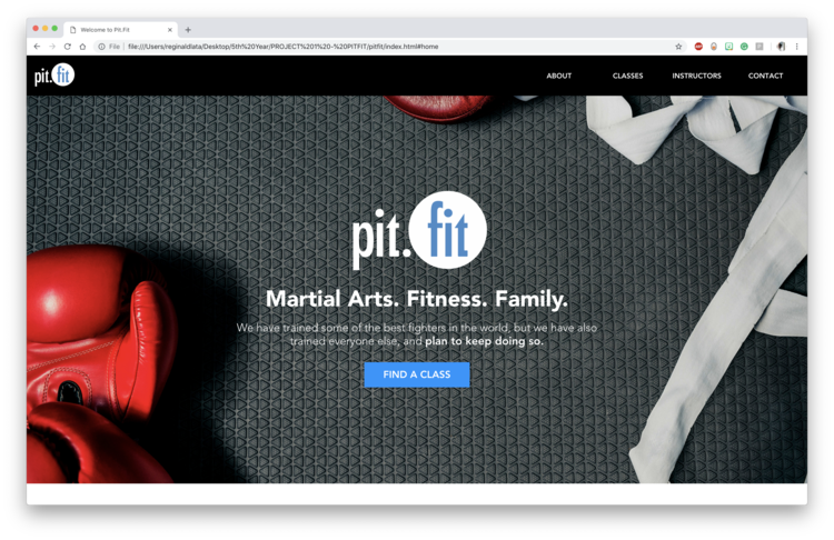
There was a lot of change from the prototype. I ended up moving forward with the one-page scroll design and it turned out better than I expected. Although it might not be the best looking design, I was able to learn how to code parallax scrolling which was pretty cool. The page eliminates the extra clicking and all the information need is just a scroll away.
So What Changed?
Well… A lot. I wanted to take this time to highlight some of my decisions that led to the final product. Again, I took this project as an opportunity to learn new coding techniques and I had a lot of fun with it.
pit.fit Brand
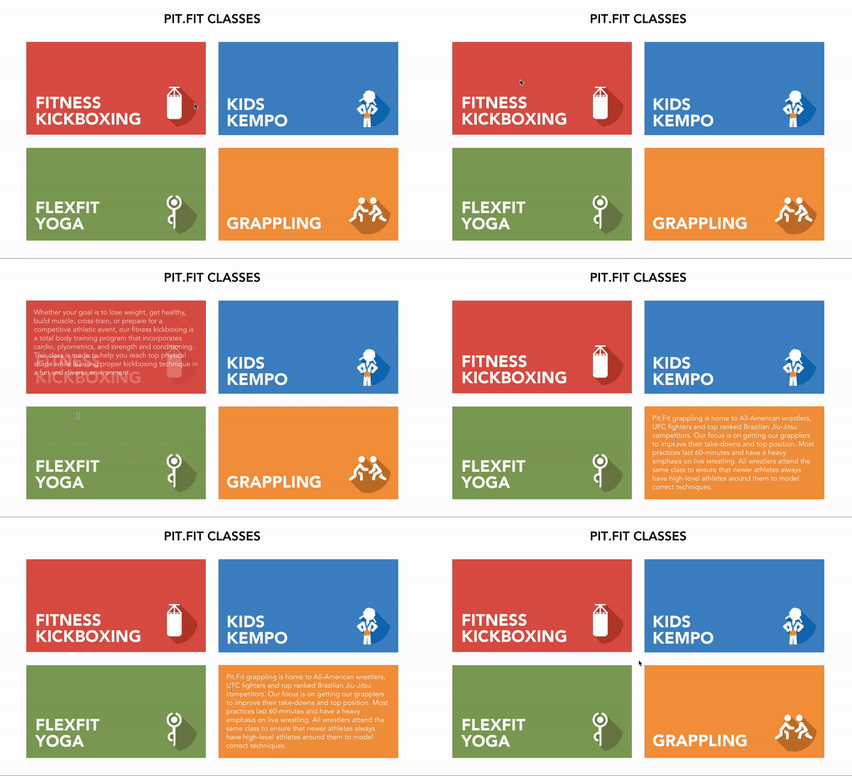
When picking colors for the site I decided to keep the same branding that pit.fit has used in their original website. I’ve incorporated the colors that are used by giving each class their respective colors. This allows the site to just have more color and feel more livelier and family-friendly.
Continuous Scrolling
Having all the content readily available will allow users to navigate the page easier and quicker. This was also a great way for me to practice using flexbox. One of my weaknesses when it come to coding webpages is responsive design. Flexbox helped me figure out how to properly code the page so that images respond well with the size of the window.
Call-To-Action
One of the things that I felt was necessary for pit.fit was to have a large call-to-action for the different classes that they offer, since they’re so unique. By including a huge call-out the minute a user enters the page shows that pit.fit isn’t your normal gym.
No Interior Pages
Another big problem with the old website was that each class had their own pages, but had almost no content on any of them. With the use of hovering, I’ve made it so that there are no need for the interior pages and the description of the classes are available on the main page. This saves users from clicking through the website to find what they’re looking for.
Moving Forward
This was a really fun and informative project and I wish I got to more of these when I lived in San Luis Obispo, since there were a lot of local businesses that I could’ve reached out to. As for pit.fit I hope that they continue to add more classes and invite new instructors so that their gym continues to grow. In terms of design, after getting some feedback from peers, I hope to give the website a more structured grid so that items are properly spaced.


